Pantone Color of The Year 2025: Incorporating Mocha Mousse in Learning Environments
- February 14, 2025
- MiEN
The Pantone Color of the Year 2025 is Mocha Mousse, a hue Pantone describes as “a warming brown, imbued with richness, nurturing us with its suggestion of the delectable qualities of chocolate and coffee, and answering our desire for comfort.” Mocha Mousse is inviting and sophisticated, and its earthy elegance enables it to stand alone or serve as a versatile foundation in designs, enhancing a wide range of color palettes and applications.
MiEN’s surface materials partners offer fabrics in various textures and compositions that are similar to Mocha Mousse. For a clean vinyl textile that’s coated and easy to care for, we like Hyde CV in “Camel” from Momentum. Etch in “Penny” by Mayer Fabrics is a vinyl and polyester upholstery fabric that we appreciate for its ink and dye resistance. Our most luxurious pick is Olympus in “Dusty Rose” from Arc-Com, which is a woven Supreen fabric that is oil and water stain resistant. All of these fabrics have a reduced environmental impact––including various sustainability certifications–and are free of several toxins, contributing to a healthier indoor environment.
If you’re more interested in using Mocha Mousse as an accent color, Wrap in “Fiesta” incorporates the brown hue alongside a color palette of blue, dark gold, and deep sage green. This patterned fabric from Designtex is a great way to tie Mocha Mousse into a more diverse color palette, pairing beautifully with warm gold and green tones and fabrics with a natural texture, such as woven fabrics and other performance fabrics designed to look like linen, wool, or leather.
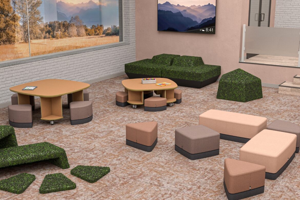
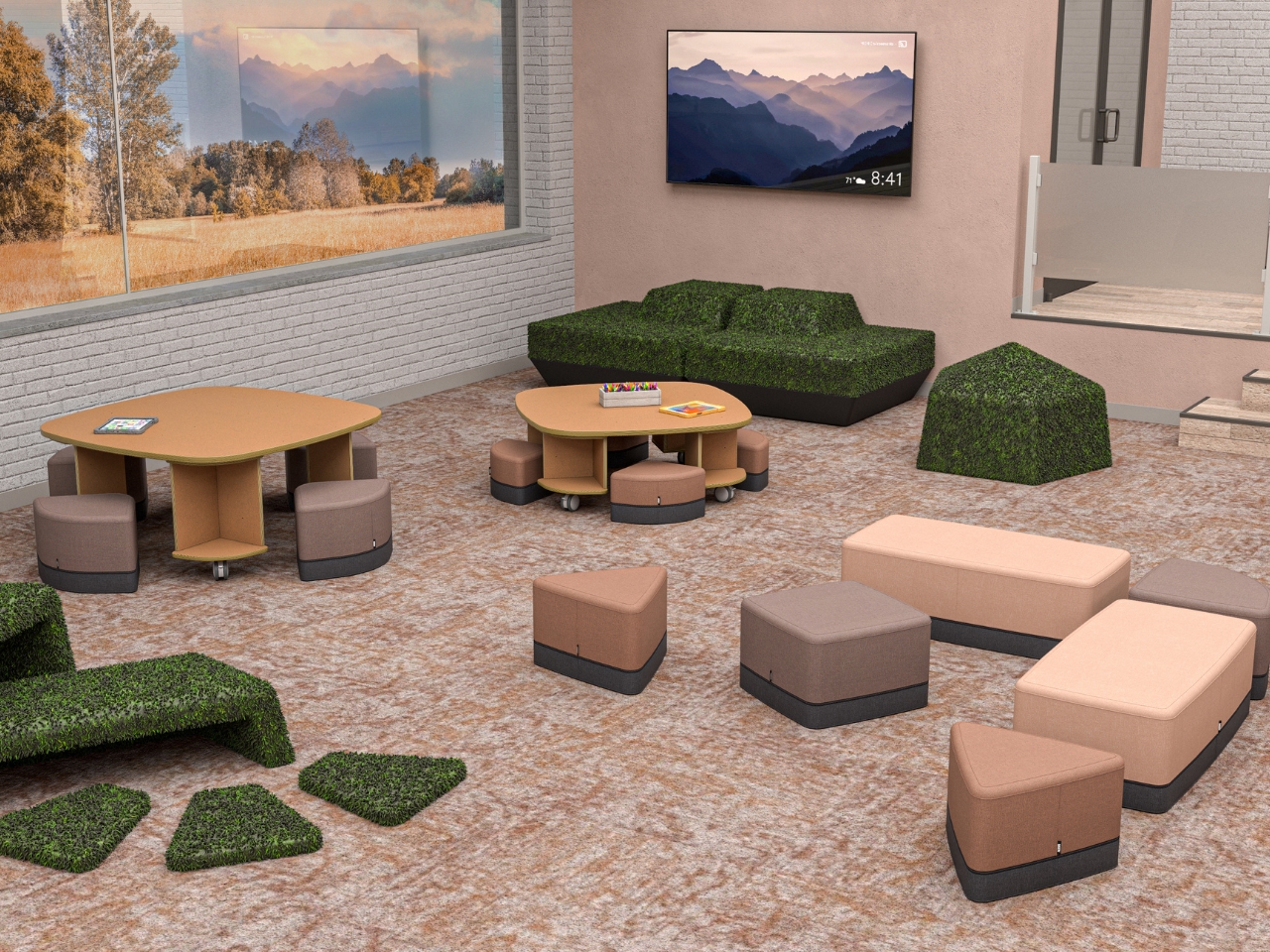
Mocha Mousse can also guide design decisions about hard surfaces in learning environments. With its rosy undertones, Mocha Mousse pairs best with warm-toned materials, such as laminate surfaces in Oiled Walnut or Natural Teak with a natural wood-like finish. Try to avoid cool-toned industrial materials like unfinished metal and concrete when choosing table surfaces to pair with Mocha Mousse. Instead opt for natural-looking materials, earthy tones, subtle patterns, and soft textures. This will keep the overall aesthetic of the space in harmony with the color’s warm, rosy, brown hues.

Mocha Mousse fits seamlessly into nature-driven designs, coordinating perfectly with neutral tones like deep chocolate browns, creamy grays, muted sky blues, and soft mossy greens. This quality also makes the hue a practical choice when incorporating built-ins and other school features made of unpainted wood or brick into the color palette of facility redesigns.
For a truly nature-inspired look, consider earthy geometric fabrics, which pair perfectly with wood finishes, neutral tones, and accents of greenery. Neutral patterns with warm brown tones, creamy gray, and smoky blue are reminiscent of natural landscapes all over the U.S like the Grand Canyon, the Pacific Northwest, and the Blue Ridge Mountains. These color palettes help cultivate serene learning spaces where learners can feel calm and focused. Some of our favorite nature-inspired fabrics that incorporate Mocha Mousse include:
Paradox in “Harvest” from Mayer fabrics
Polygon in “Cove” and “Breeze” from CF Stinson
Harlequin in “Adobe” from Arc-Com
Marquetry in “Sequoia” from CF Stinson
For a more whimsical color palette, pair Mocha Mousse with fresh greens, cornflower blues, goldenrod yellows, terracotta oranges, lilac purples, and rosy pinks. Adairsville Elementary School chose this approach when MiEN helped redesign its library, selecting Mayer All Seasons fabric as a grounding color palette for the space. Then, we added pops of color throughout the library, creating a playful and engaging space that still feels tranquil and welcoming.
Mocha Mousse doesn’t have to be the highlight of the color palette to provide a strong foundation for a variety of different design approaches. By centering learning space design around this rich, creamy brown, the overall atmosphere is enhanced, becoming less sterile and more inviting. Even the most bright, white, and bland environments are immediately warmed up by adding Mocha Mousse to the design.
Pops of color can still be incorporated in spaces that are centered around warm brown tones like Mocha Mousse. For instance, in its Art Room & Classroom, Tri County Elementary leaned into the neutral tones and natural wood built-in storage, as well as the flooring, which is reminiscent of warm gray stones in a creek. MiEN used Mocha Mousse as a foundation for the design rather than a fabric accent color, incorporating simple wood-toned desks with navy blue chairs and a little pop of orange where student work can be showcased. Ultimately, these rooms remain calming and easy to focus in but still have the vibrant element of fun and excitement that gets students’ creativity flowing.


One benefit to adding Mocha Mousse to your color palette is this color’s superior ability to camouflage dirt, stains, and general wear. While MiEN partners with textile manufacturers that create long-lasting, durable surface materials, accidents do happen, so it’s reassuring to know that your investment will remain looking fresh even in spaces frequented by hundreds of young students.
Additionally, bringing rich and comforting colors into your learning environments can positively impact both mood and behavior in students and teachers. This is because of the concept of color theory, which suggests that colors evoke psychological reactions and influence the way individuals feel and behave. As a brown tone, Mocha Mousse is calming and grounding, associated with a sense of warmth, coziness, and safety. This color reflects a shift to neutral, calm colors in learning environments as students continually struggle with mental health, motivation, and engagement five years after the pandemic began. The natural earth-like qualities of this hue emanate an atmosphere of security and stability, promoting feelings of resilience and comfort.
Mocha Mousse is a sophisticated color choice for a variety of work environments. Many employees have had an opportunity to work from home at some point in the past five years and are longing for office spaces that are welcoming and evoke the same sense of warmth as their actual homes. As employers search for ways to make the office more inviting, they are shifting away from sterile gray office spaces to make the atmosphere feel homier. Mocha Mousse and its coordinating color palettes are a great way to bring some life back into a work environment, making employees feel more relaxed and comfortable, and encouraging them to spend more time in the office.
The Pantone color of the year is chosen to reflect the culture and trends of the year, setting a tone for design, media, and more. Mocha Mousse provides a sensory and comforting warmth, while also emulating a sense of nature. Incorporating this hue into your learning environments can help to soften and refresh stagnant spaces, inspiring comfort and connection.